Purpose: This article provides a clear and detailed overview of your shipping costs, empowering you with greater visibility, control, and insights to optimize your shipping strategy.
Costs Overview Explained
This article explains how to use the Shipping Costs Overview dashboard to track, analyze, and optimize your shipping expenses. You'll learn how to interpret key metrics, compare costs across carriers and countries, and spot trends over time.
Use this dashboard to gain clarity on your shipping performance and make informed decisions that help reduce costs and improve operations.
Filters
The analytics feature includes multiple filter options, allowing you to refine data and analyze specific aspects of your shipping activities. Using filters effectively helps in identifying trends, assessing performance, and making data-driven decisions. For the Shipping Costs dashboard, we have the following filters available.
Check here the available filters:
You can customize the dashboard view using the following filters:
- Date Range – Select a specific time period to analyze shipping trends over days, weeks, or months.
- Brand – Filter parcels by a specific brand if multiple brands are managed under one account.
- Carrier – View parcels handled by a particular carrier to assess the shipping costs of a specific carrier.
- Destination Country – Focus on parcels delivered to a specific country to evaluate regional shipping efficiency.
- Integration – Narrow down parcels by sales channels, such as specific e-commerce platforms or order management systems.
- Origin Country – Analyze parcels based on their country of origin to assess outbound shipping trends.
- Product Name – Filter data based on specific products to track their shipping performance and return rates.
- Product SKU – Use SKU-based filtering to monitor the parcels trends of individual product variants.
KPIs and their description
Parcels in view
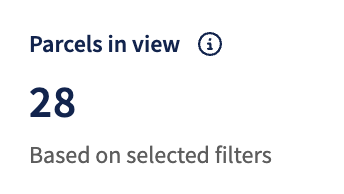 What it shows: This KPI represents the total number of parcels within the selected date range.
It helps assess the reliability of the other data presented in the overview. A higher number of included parcels generally indicates that the insights derived from the data are more meaningful.
Pending parcel differences
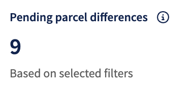 What it shows: Parcels within the selected date range that are still eligible to receive surcharges and other costs. Surcharges are typically not invoiced immediately, as they’re applied during the shipping process. The number shown here reflects the parcels that may still incur additional charges.
This is based on the expected surcharges and is an indication of what costs could be potentially added. This is not guaranteed and is based on estimation.
Estimated Shipping cost
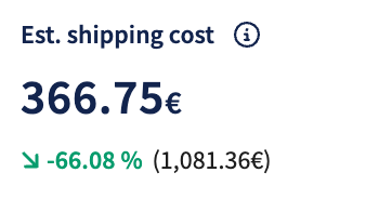 Note: This KPI is only applicable to users who ship via our Sendcloud rates. If you use your direct contract with a carrier, no data will be shown for this KPI.
What it shows: Estimated shipping costs based on completed parcels within the selected date range. The focus is on estimating shipping costs, including any expected surcharges that may still be applied. Expected surcharges are based on estimation and can be higher or lower after ‘finalized costs’.
Average costs per parcel
 What it shows: The average costs per parcel for all the parcels done within the selected date range. At the moment, this only includes the base parcel costs and excludes any surcharges.
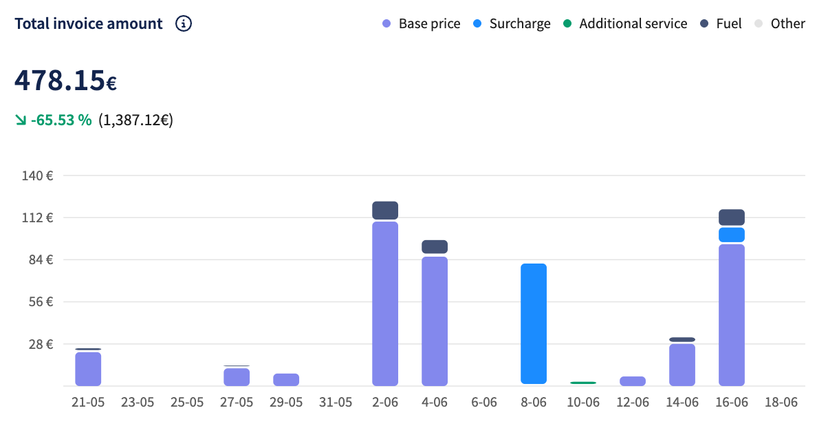
Total invoice amount
What it shows: The total invoiced Sendcloud shipping costs within the selected date range, broken down by category. This stacked bar chart shows the total invoice amounts for labels created within the selected date range. The costs are divided into different categories for greater insight:
- Base price: The standard shipping cost charged by the carrier.
- Surcharge: Any additional surcharges, excluding fuel-related charges.
- Fuel: Fuel-specific surcharges applied during shipping.
- Additional services: Costs for services such as insurance, pickups, insurance refunds, and claims.
- Other: Import-related costs, including VAT, duties, and administrative fees.
Each color in the chart represents one of these categories, helping to visualize how different cost components contribute to the overall invoice amount.
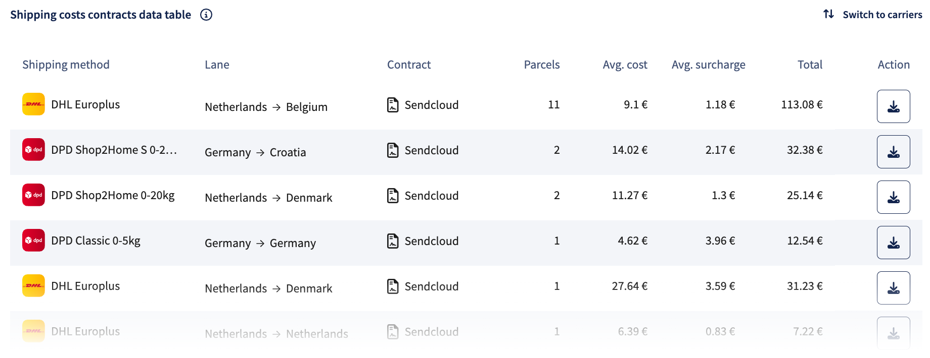
Shipping costs contracts data table
What it shows: This data table displays detailed cost insights per shipping method within the selected date range, based on Sendcloud contract rates. Each row includes information on:
- Shipping method: The specific service used, including carrier name.
- Lane: The route or country pair for the parcel.
- Contract: The contract will be shown as Sendcloud when shipping via our rates.
- parcels: The number of parcels completed within the selected date range.
- Average cost and Average surcharge: Calculated averages for base shipping and additional charges.
- Total: Total cost for that shipping method.
You can download raw data in CSV format for further analysis, or switch to a carrier view to see aggregated costs by carrier instead of method.
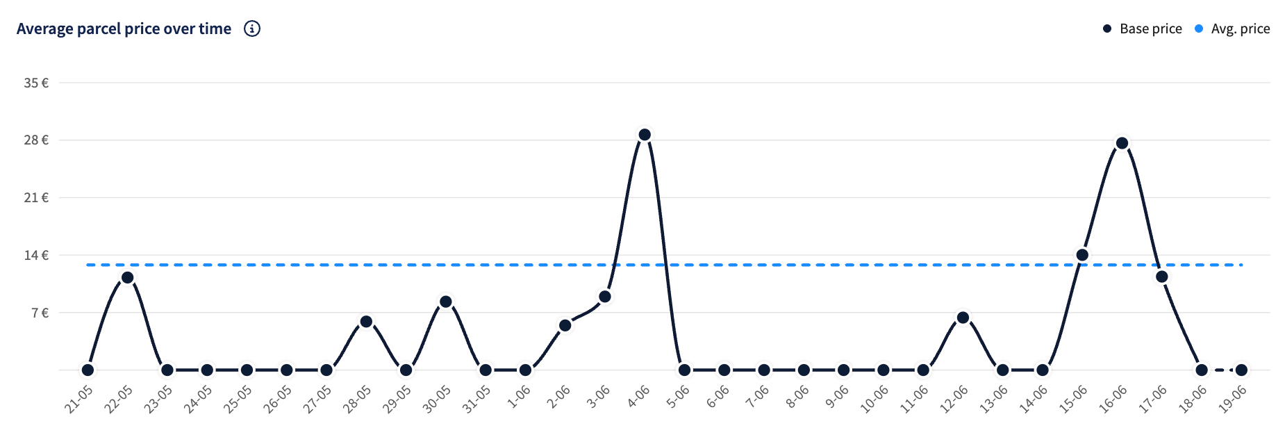
Average parcel price over time
What it shows: This line chart shows the daily development of parcel costs across the selected date range. It compares:
- Base price: The standard rate charged per parcel, excluding any additional costs.
- Average price: The overall average cost per parcel, potentially including surcharges and extra services.
Use this chart to identify pricing trends, fluctuations, and patterns in your shipping costs over time.
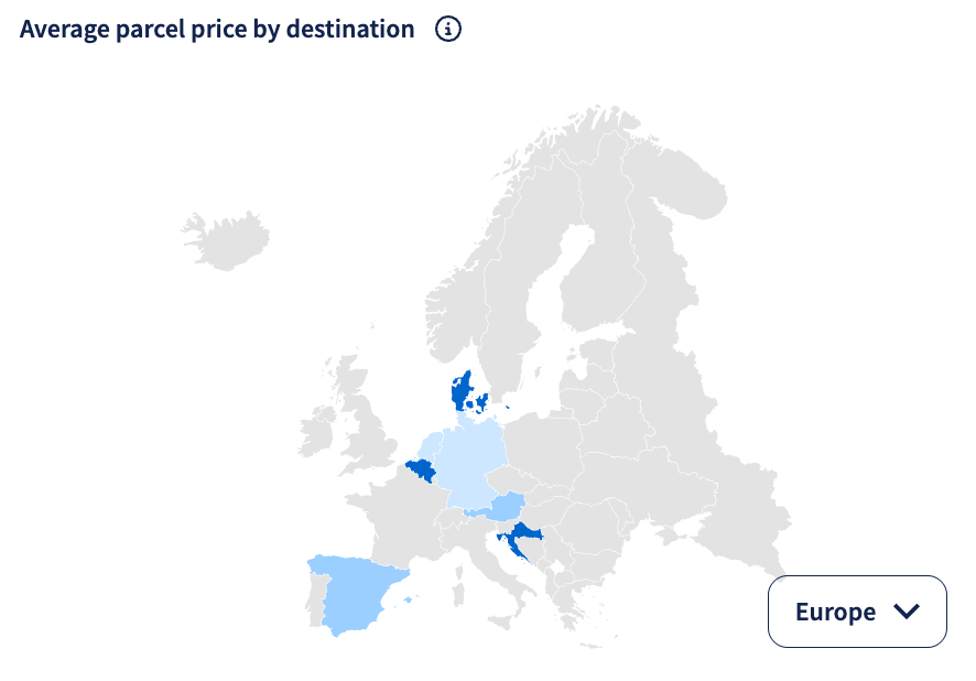
Average Parcel Price by Destination
What it shows: This geo map displays the average parcel price by destination across different countries. The darker the shade of blue, the higher the average parcel price for that region.
Users can drill down into specific continents for a more detailed view.
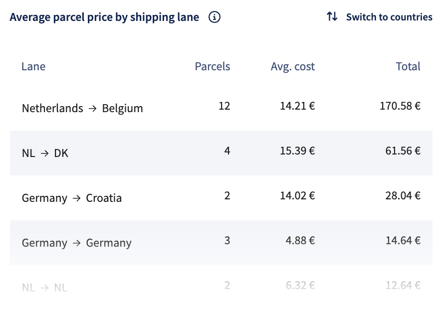
Average Parcel Price by Shipping Lane
What it shows: This table provides an overview of the average parcel price per shipping lane within the selected date range, with the option to switch to a country-based view.
- Shipping lane: Route between origin and destination countries.
- parcels: Total number of parcels made per lane or country.
- Average cost: Average parcel cost calculated for each lane or country.
- Total: Total cost of all parcels per lane or country.
- Country (only in country mode): Aggregated view of all parcel data per country.
The view allows quick comparison between different lanes or countries based on parcel volume, average cost, and total spend.
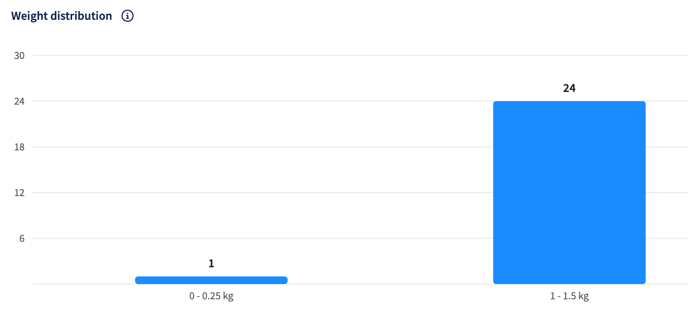
Weight distribution
What it shows: This visualization helps identify whether higher shipping costs are caused by unexpectedly larger parcel sizes. It can also support improvements to internal operations, ensuring the correct label is applied and verifying that product dimensions align with the actual shipment weights.