Purpose: Get a complete overview of your shipping performance. Track total parcels, on-time deliveries, exceptions, and transit times.
Shipping Transit Times Explained
Transit time is the time it takes for a parcel to move from order placement to delivery. Tracking transit times helps businesses see how fast parcels are processed, identify delays, and improve their shipping operations.
Analyzing these metrics can speed up shipping, improve customer satisfaction, and make better decisions about their carriers and logistics.
Trends
| Arrows |
↗Indicates an improving trend compared to the previous period*. This can be positive or negative depending on the KPI. For example: |
↙Indicates a declining trend compared to the previous period*. The impact depends on the KPI: |
| Colors |
● Represents an improvement in transit time performance. For example: |
● Indicates a decline in transit time performance. This could mean: |
*What does "previous period" mean?
By default, the previous period refers to the timeframe immediately before the currently selected date range. It follows the same length as the selected period.
- If you choose a single month, the previous period is the month before (e.g., February 2025 → January 2025).
- If you select a range of months, the previous period will be the same length of time directly before that range (e.g., October–December, → July–September).
If you use the comparison filter, the trend metrics will be based on the custom timeframe you select, not the default "previous period." This means trends will reflect your chosen comparison range, rather than the automatically calculated period before your selected date range.
Filters
The analytics feature includes multiple filter options, allowing you to refine data and analyze specific aspects of your shipping activities. Using filters effectively helps in identifying trends, assessing performance, and making data-driven decisions.
Check here the available filters and their applications
You can customize the dashboard view using the following filters:
- Add Date Range (Shipping Overview only) – Use this filter to compare your selected timeframe against a second, custom date range. Applying this filter updates all graphs and trend metrics to reflect the comparison, enabling deeper analysis between two distinct periods.
- Brand – Filter parcels by a specific brand if multiple brands are managed under one account.
- Carrier – View parcels handled by a particular carrier to assess performance and reliability.
- Destination Country – Focus on parcels delivered to a specific country to evaluate regional shipping efficiency.
- Integration – Narrow down parcels by sales channels, such as specific e-commerce platforms or order management systems.
- Origin Country – Analyze parcels based on their country of origin to assess outbound shipping trends.
- Product Name – Filter data based on specific products to track their shipping performance and return rates.
- Product SKU – Use SKU-based filtering to monitor the parcels trends of individual product variants.
KPIs and their description
Time to First Scan

What it shows: This KPI measures the time between when a customer places an order and when the parcel receives its first scan by the carrier, indicating that it has been handed over and entered the shipping network.
It represents the typical (median) time it takes for carriers to scan or pick up a parcel after the order is created, for labels created within the selected date range.
It reflects how quickly the shipping process begins, providing insights into both order processing efficiency and carrier handover performance.
A shorter time to first scan suggests faster internal processing and smoother carrier pickup, potentially allowing for later cutoff times on the webshop while still ensuring timely dispatch.
A longer time to first scan may point to delays in order handling or pickup by the carrier, highlighting opportunities for improvement in early-stage logistics.
Faster scans → Improved efficiency, quicker response times, and more flexibility in order acceptance windows.
Slower scans → Potential delays in internal processing or carrier pickup, requiring investigation to optimize shipping performance.
First Delivery Attempt
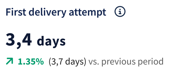 What it Shows: This KPI measures the number of days from when a package is in the carrier’s possession to when the first delivery attempt is made. It reflects the carrier’s efficiency and responsiveness in handling deliveries.
It measures the time it takes for 95% of parcels to reach the first delivery attempt, calculated from the carrier’s first scan date, for labels created within the selected date range.
A shorter time to the first delivery attempt indicates faster service and improved operational efficiency, ensuring quicker deliveries and better customer satisfaction. A longer time may signal delays in the carrier’s processes, highlighting areas that need improvement.
- Faster first delivery attempts → Improved carrier efficiency and quicker service.
- Slower first delivery attempts → Possible inefficiencies or delays that may require attention to optimize delivery performance.
Median time in transit
 What it Shows: This KPI measures the typical (median) time it takes from the carrier’s first scan or pickup to the first delivery attempt, for labels created within the selected date range. It provides a clear view of how quickly parcels are delivered, offering insights into overall shipping efficiency.
A shorter median transit time indicates faster deliveries, improved operational performance, and a better customer experience. This can also enhance conversion rates or marketplace rankings by consistently meeting delivery expectations.
Conversely, a longer transit time may suggest potential delays or inefficiencies in the shipping process, requiring attention to maintain reliable service.
- Reduced transit time → Faster deliveries, improved efficiency, and higher customer satisfaction.
- Increased transit time → Possible delays or inefficiencies that need to be addressed to improve delivery performance.
Cycle Time
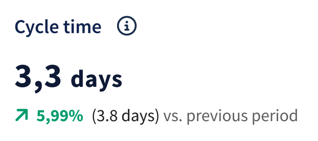 What it Shows: This KPI measures the time it takes for 95% of parcels to reach the first delivery attempt, measured from the order date, for labels created within the selected date range.
It reflects the efficiency of the entire supply chain process, from order creation to the first delivery attempt, and highlights how quickly parcels move through order processing, handover to carrier, and initial transit.
How it is calculated:
It is calculated as the difference between the order placement date and the date of the first delivery attempt.
A lower cycle time indicates faster order processing and delivery, leading to improved efficiency, higher customer satisfaction, and potentially better customer retention.
On the other hand, a higher cycle time may signal delays or bottlenecks in the supply chain, which can negatively impact customer experience and brand reputation.
- Faster cycle times → More efficient operations, improved customer service, and a competitive advantage.
- Slower cycle times → Possible delays or inefficiencies that need attention to reduce costs and enhance delivery performance.
Tracking this KPI helps identify specific areas for improvement, allowing businesses to optimize processes, reduce costs, and improve overall resource utilization.
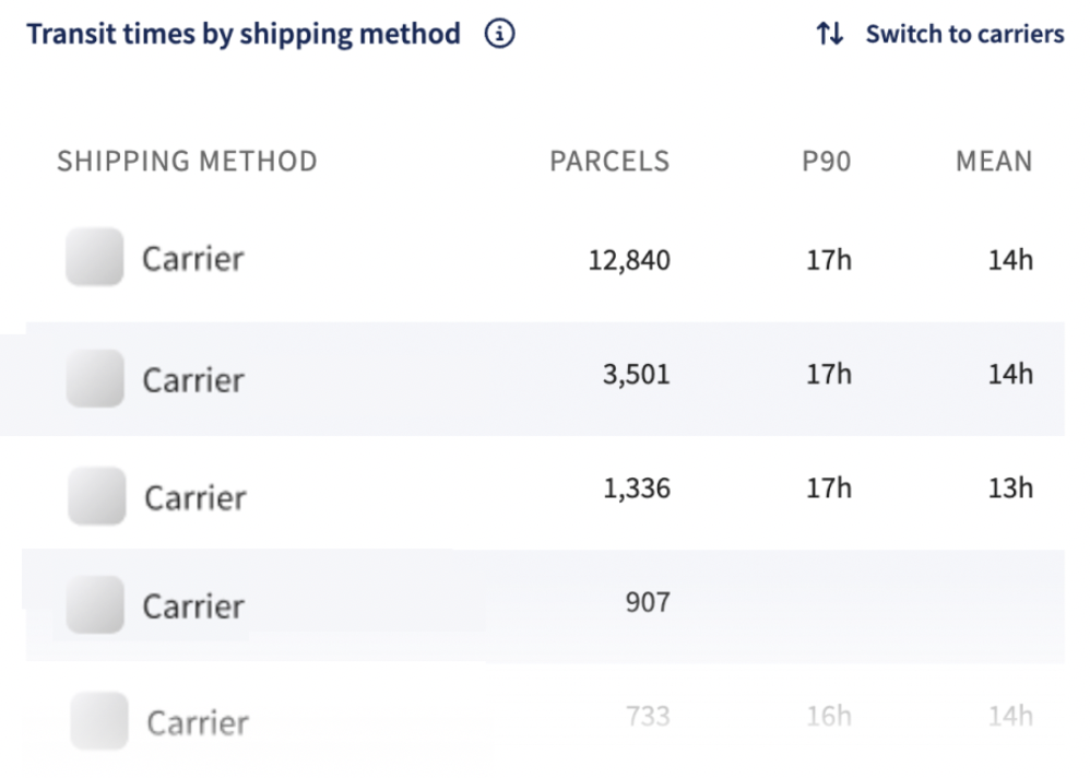
Transit Times by Shipping Method
What it Shows: This table provides a detailed comparison of the number of parcels, along with typical (median) and longer (P90) delivery times, from the carrier’s first scan or pickup to the first delivery attempt, for labels created within the selected date range, grouped by carrier or method.
Key Features:
- Clear data presentation → Typical and longer transit times, along with parcel volumes, are displayed for easy performance analysis.
-
Interactive tools:
- Vertical scroll → View additional data for large datasets.
- Switch between carriers and shipping methods → Compare transit times by shipping method or carrier to identify performance trends.
Strategic Insights:
- Understanding variations in transit times and parcel volumes helps pinpoint bottlenecks and areas for improvement.
- The ability to toggle between shipping methods and carriers provides a flexible analysis tool for logistics planning.
- Data-driven decision-making ensures the most efficient shipping strategies are selected based on real-time insights.
Transit Times per Carrier
What it Shows: This chart provides a visual comparison of transit times for each carrier, measured in days, while also displaying parcel volumes to contextualize carrier performance.
Transit time is defined as the time it takes for 95% of parcels to reach the first delivery attempt, measured from the carrier’s first scan date, for labels created within the selected date range, grouped by carrier or method.
It helps identify which carriers are faster and more reliable at a glance.
Key Features:
- Transit times and parcel volumes are displayed together for clear performance insights.
- Easy carrier comparison to evaluate delivery speed and consistency.
-
Interactive tools:
- Horizontal scroll → Explore more data points without cluttering the view.
- Switch between carriers and shipping methods → Analyze transit times from different perspectives to refine shipping strategies.
Strategic Insights:
- Helps pinpoint carriers that consistently meet or exceed delivery expectations.
- Highlights carriers that may require attention to address delays.
- The toggle feature helps determine whether issues stem from specific carriers or shipping methods, aiding in data-driven logistics optimization and improved customer satisfaction.

Median Transit Time Over Time
What it Shows: This chart visually tracks changes in typical (median) transit time over a specified period, using a trend line to show how delivery times have evolved.
Transit time is measured from the carrier’s first scan or pickup to the first delivery attempt for labels created within the selected date range.
It helps monitor shipping efficiency and identify long-term patterns that may impact carrier performance or shipping method effectiveness.
Key Insights:
- Trend analysis → The trend line reveals whether transit times are decreasing (improved efficiency) or increasing (potential delays or issues).
- Performance tracking → Helps assess the impact of logistical changes and identify seasonal variations.
- Strategic decision-making → Supports informed adjustments to shipping strategies for improved efficiency and customer satisfaction.
By regularly analyzing these trends, businesses can pinpoint successful improvements and areas needing attention, ensuring optimized shipping operations.

Median Transit Time by Destination (Geo-map)
What it Shows: This interactive geo-map visualizes the typical (median) delivery time based on the carrier’s first scan or pickup to the first delivery attempt, for labels created within the selected date range, grouped by destination country.
It provides a clear representation of how long it typically takes for parcels to reach various countries worldwide, serving as a powerful tool for analyzing shipping performance across regions and optimizing logistics strategies.
Key Features:
- Interactive navigation → Click on countries to zoom into specific regions and filter data based on selected areas.
- Dropdown menu → Located at the bottom right, set to ‘World’ by default, with Europe highlighted initially for focused analysis. Users can switch between continents to compare transit times across different countries.
Why It’s Useful:
- Allows quick identification of transit time patterns across different locations.
- Provides insights into logistical changes or external factors affecting shipping times.
- Helps optimize supply chain efficiency and improve overall customer satisfaction.
By making complex data more accessible and interactive, this tool enables stakeholders to make informed, data-driven decisions for enhancing shipping operations.

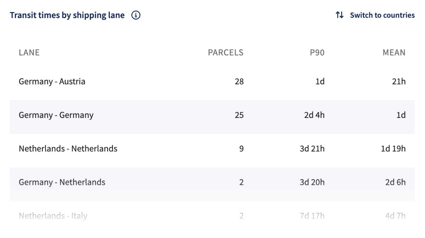
Transit Times by Shipping Lane
What It Shows: This chart provides a detailed analysis of the number of parcels, along with typical (median) and longer (P90) delivery times, grouped by shipping lane (country to country).
Transit time is measured from the carrier’s first scan or pickup to the first delivery attempt, for labels created within the selected date range.
It helps assess shipment flow and carrier performance between different countries by combining delivery speed insights with parcel volume information.
Key Features:
- Clear performance insights → Compare transit times across shipping lanes using both P90 and mean values.
- Volume tracking → Understand shipping trends by analyzing the total number of parcels per lane.
-
Interactive tools:
- Vertical scroll → View additional data rows for in-depth analysis.
- Switch between country and shipping lane views → Toggle between data by shipping method or carrier to gain different insights.
This flexible and data-rich visualization helps identify performance trends, optimize shipping strategies, and make informed decisions based on real-time transit data.
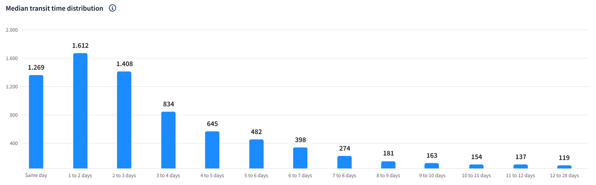
Transit Time Distribution
What It Shows: This chart shows the distribution of parcels across different transit time ranges, based on the time from the carrier’s first scan or pickup to the first delivery attempt, for labels created within the selected date range.
It helps evaluate shipping efficiency by illustrating how quickly parcels are typically delivered and identifying patterns in delivery consistency.
Key Insights:
- Visual overview → Quickly see how many parcels are delivered within a given timeframe.
- Performance trends → Identify whether deliveries are consistently fast or if delays are common.
- Strategic improvements → Spot patterns to optimize shipping routes, improve logistics, and reduce transit times.
Interactive Features:
- Explore specific timeframes → Click on segments to analyze how different delivery times impact overall efficiency.
- Identify areas for optimization → Use real-time data to refine shipping processes and enhance customer satisfaction.
This dynamic visualization provides actionable insights for improving delivery performance, ensuring that logistics strategies are aligned with operational goals.