
Purpose: This article provides detailed analytics on shipping exceptions to help identify root causes and enhance operational efficiency through targeted data-driven insights.
Shipping Exceptions Explained
The Exceptions Dashboard provides valuable insights into shipping issues that may impact delivery performance. It helps track and analyze parcels that encounter delays, errors, damages, or losses, allowing businesses to identify patterns and improve their logistics processes.
This article explains the different Key Performance Indicators (KPIs) related to exceptions.
By understanding these KPIs, businesses can take proactive steps to reduce shipping disruptions, improve carrier performance, and enhance customer satisfaction.

Trends
|
Arrows |
↗ Shows an increasing trend compared to the previous period*, which can be good or bad depending on the KPI. For Example: Positive: Fewer lost or damaged parcels, meaning better shipping reliability. Negative: More exceptions or errors, indicating potential shipping issues. |
↙ Shows a decreasing trend compared to the previous period*, which can be good or bad depending on the KPI. For example: Positive: Fewer exception events or errors, indicating smoother shipping operations. Negative: Fewer delivered parcels, which may signal reduced shipping efficiency. |
|
Colors |
● Represents an improvement in shipping performance. For example: Fewer damaged or lost parcels, showing better handling and shipping accuracy. A lower exception rate, meaning fewer disruptions in the shipping process.
|
● Indicates a decline in shipping performance. This could mean: More lost or damaged parcels may signal packaging or carrier issues. |
*What does "previous period" mean?
By default, the previous period refers to the timeframe immediately before the currently selected date range. It follows the same length as the selected period.
- If you choose a single month, the previous period is the month before (e.g., February 2025 → January 2025).
- If you select a range of months, the previous period will be the same length of time directly before that range (e.g., October–December, → July–September).
If you use the comparison filter, the trend metrics will be based on the custom timeframe you select, not the default "previous period." This means trends will reflect your chosen comparison range, rather than the automatically calculated period before your selected date range.
Filters
The analytics feature includes multiple filter options, allowing you to refine data and analyze specific aspects of your shipping activities. Using filters effectively helps in identifying trends, assessing performance, and making data-driven decisions.
Check here the available filters and their applications
You can customize the dashboard view using the following filters:
- Add Date Range (Shipping Overview only) – Use this filter to compare your selected timeframe against a second, custom date range. Applying this filter updates all graphs and trend metrics to reflect the comparison, enabling deeper analysis between two distinct periods.
- Brand – Filter parcels by a specific brand if multiple brands are managed under one account.
- Carrier – View parcels handled by a particular carrier to assess performance and reliability.
- Destination Country – Focus on parcels delivered to a specific country to evaluate regional shipping efficiency.
- Integration – Narrow down parcels by sales channels, such as specific e-commerce platforms or order management systems.
- Origin Country – Analyze parcels based on their country of origin to assess outbound shipping trends.
- Product Name – Filter data based on specific products to track their shipping performance and return rates.
- Product SKU – Use SKU-based filtering to monitor the parcels trends of individual product variants.
KPIs and their description
Exception Events
 What it shows: This KPI tracks the number of parcels with at least one exception, for parcels announced within the selected date range.
This KPI measures:
- The total number of parcels that encountered at least one exception.
- Helps identify potential disruptions in the shipping process.
Fewer exceptions indicate improved shipping performance, smoother operations, and better handling.
More exceptions may signal possible issues that need attention, as frequent disruptions can affect efficiency and customer satisfaction.
Monitoring this metric helps maintain reliable and efficient shipping operations.
Error Rate
 What It Shows: This KPI measures the percentage of parcels that encountered an exception. It is calculated as:
(Parcels with at least one exception ÷ Total Parcels) × 100%
A lower exception rate indicates improved shipping reliability, better quality control, and fewer disruptions, while a higher exception rate highlights more frequent issues per parcel.
An increasing trend may signal potential concerns that require further investigation to maintain efficient shipping operations and customer satisfaction.
Tracking this KPI helps identify trends and areas for improvement in the shipping process.
Damaged
 What It Shows: This KPI tracks the number of parcels with a damaged scan, for labels created within the selected date range.
It helps evaluate packaging and handling effectiveness while highlighting areas for improvement.
Fewer damaged parcels indicate better packaging, handling, or delivery methods.
An increase suggests potential issues that need to be addressed to prevent further damage.
Utility: Monitoring this KPI is essential for logistics teams to enhance shipping safety and reliability. By identifying weaknesses in packaging or handling, businesses can reduce damage, lower costs from returns and replacements, and improve customer satisfaction.
Lost Parcels
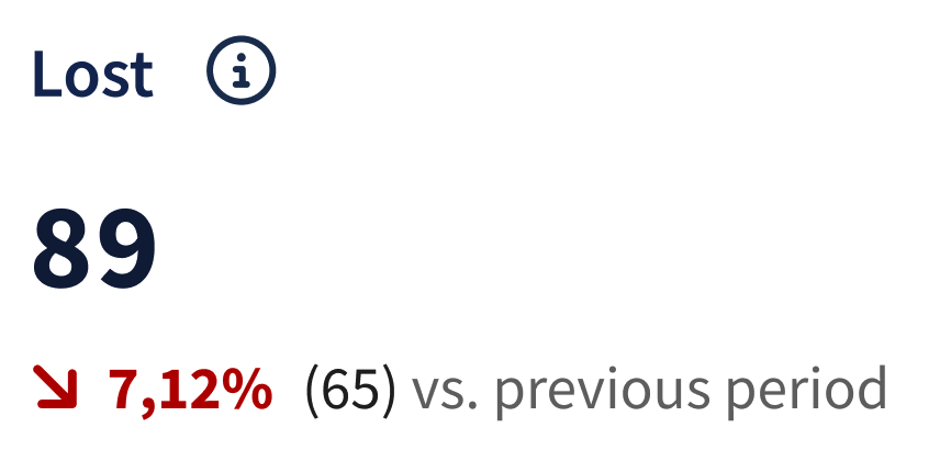 What It Shows: This KPI measures the number of parcels with a missing scan, for labels created within the selected date range.
It serves as a direct indicator of the effectiveness and reliability of the tracking and shipping processes. Monitoring these figures is crucial for:
- Assessing the reliability of delivery and tracking systems.
- Identifying specific points in the shipping process that may be prone to errors.
- Implementing targeted improvements to prevent future parcel losses, thereby enhancing overall customer satisfaction and operational efficiency.
Fewer lost parcels suggest improved tracking accuracy, better delivery reliability, and enhanced operational procedures.
An increase in lost parcels may point to issues in scanning or shipping processes that require immediate attention to reduce losses and maintain service quality.
Regular monitoring of this KPI helps businesses maintain a secure and efficient shipping process.
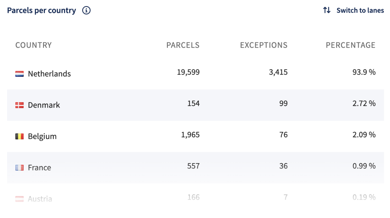
Parcels per Country (Table)
What It Shows: This table is instrumental in monitoring shipping performance across different countries or lanes, providing critical insights into where exceptions occur most frequently.
This table provides a detailed view of the number of parcels or parcels per country or shipping lane. It includes:
- Exceptions Column: Indicates the number of parcels or parcels that have encountered an exception, helping to gauge the frequency and severity of issues.
- Percentage: Shows the proportion of exceptions relative to the total number of parcels, giving a clear picture of problem areas within specific regions or lanes.
Features and Interactivity:
- Vertical Scroll: Scroll down to see more rows of data, making it easier to view large datasets.
- Switch to Lanes Option: Change the view from countries to shipping lanes to better understand shipping routes and where exceptions happen. This helps with logistics planning and analysis.
Exception Events per Carrier (Chart)
What It Shows: This chart helps track how well each carrier handles shipping exceptions.
It shows the number of parcels with at least one exception, for labels created within the selected date range, grouped by carrier or method. By analyzing this data, businesses can make better decisions about logistics and carrier management.
- Percentage Indicator: Shows how much each carrier contributes to overall exception events, helping pinpoint which carriers are most frequently associated with shipping issues.
Features and Interactivity:
- Vertical Scroll: Allows for viewing more rows, accommodating large datasets, and enhancing data accessibility.
- Switch to Carriers/Shipping Methods Option: Allows switching between carriers and shipping methods, making it easier to view and analyze shipping data. This helps gain deeper insights and identify areas for improvement.

Exception Events Over Time (Chart)
What It Shows: This chart shows the total number of parcels with at least one exception, for labels created within the selected date range, grouped by date interval. By analyzing these trends, logistics teams can identify patterns, make improvements, and enhance shipping reliability and customer satisfaction.
Key Features:
- Daily Breakdown: Each data point represents the total exceptions recorded on a specific day, allowing for detailed daily analysis and identification of unusual spikes or patterns.
- Trend Analysis: This chart helps identify trends and evaluate shipping performance. It highlights periods with more exceptions, making it easier to spot issues and take corrective actions.

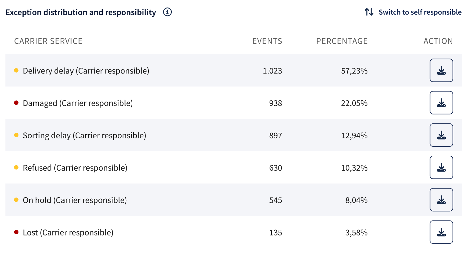
Exception distribution and responsibility
What It Shows: This chart shows the number of parcels with at least one exception, for labels created within the selected date range, grouped by exception origin.
It allows switching between "self-responsible" and "carrier-responsible" categories to see whether the issues come from internal processes or the carrier. This helps pinpoint the root causes of shipping problems and guide improvements.
Features:
- Category Toggle: Allows to assess the origin of exceptions, aiding in targeted corrective actions.
- Enhanced Accessibility: Includes a vertical scroll to explore extensive data and the ability to download information for each exception type in CSV format. This functionality supports comprehensive analysis and effective monitoring of trends and problem areas.
Utility: This chart breaks down exceptions into categories, making it easier to spot recurring issues and improve shipping processes. It helps logistics teams make better decisions, boosting efficiency and reliability across shipping channels.
Total Exception Events Distribution (Pie Chart)
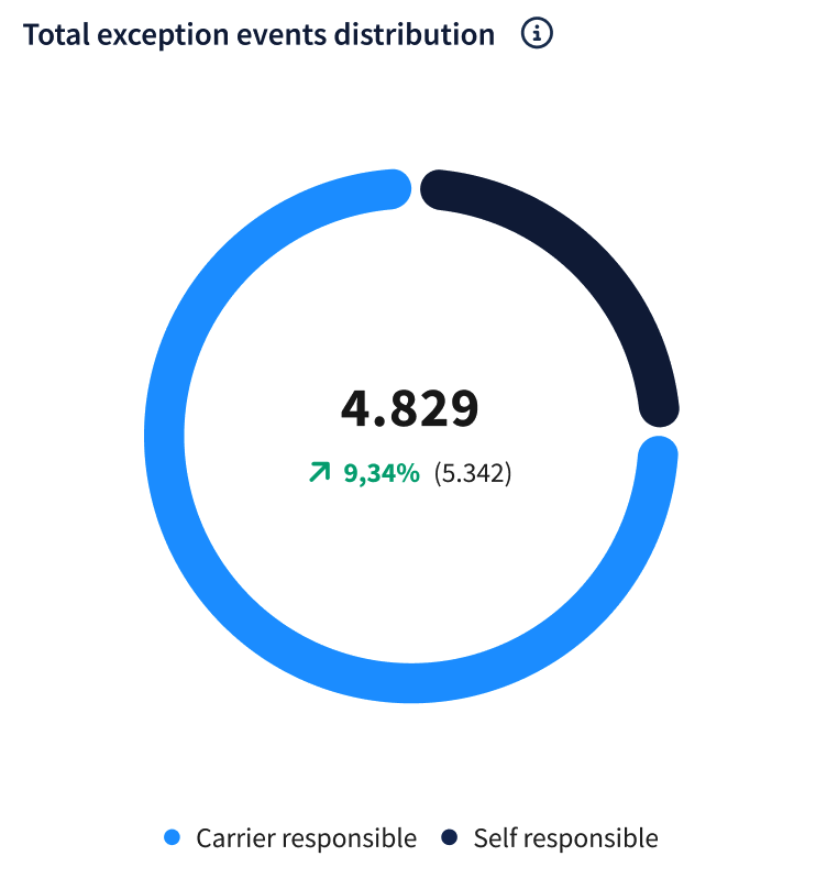 What It Shows: This pie chart shows the ratio of carrier-responsible versus self-responsible exception parcels, based on labels created within the selected date range. It helps identify the main sources of problems, making it easier to improve processes.
A decrease in exceptions related to internal operations indicates successful improvements and refinements in internal processes.
An increase in exceptions suggests worsening performance or carrier-related issues that need attention to improve shipping efficiency.
Utility: This chart helps identify where improvements are needed, whether in internal handling or carrier management. By clearly showing the source of exceptions, it allows logistics teams to focus on problem areas, improving efficiency and reliability.