
Purpose: This article helps you understand the Analytics: Shipping performance dashboard and its KPIs. Providing you with some key insights.
Shipping Performance Explained
The Performance Dashboard primarily highlights the success of parcels. For example, it examines whether parcels were delayed, not delivered at all, or successfully delivered on time at the first delivery attempt, among other metrics.
In this article, we explain the different KPIs (Key Performance Indicators) and what they represent.

Trends
| Arrows | ↗ Indicates an increasing trend compared to the previous period*. | ↙ Indicates a decreasing trend compared to the previous period*. |
| Colors |
● A green arrow indicates an improvement in the performance of this metric. This does not necessarily mean the arrow points upward; in some cases, a downward trend is positive. For example: A decrease in undelivered parcels is an improvement in performance |
● A red arrow indicates a negative trend in the performance of this metric. This does not necessarily mean the arrow points downward; in some cases, an upward trend can represent worsening performance. For example: |
*What does "previous period" mean?
By default, the previous period refers to the timeframe immediately before the currently selected date range. It follows the same length as the selected period.
- If you choose a single month, the previous period is the month before (e.g., February 2025 → January 2025).
- If you select a range of months, the previous period will be the same length of time directly before that range (e.g., October–December, → July–September).
If you use the comparison filter, the trend metrics will be based on the custom timeframe you select, not the default "previous period." This means trends will reflect your chosen comparison range, rather than the automatically calculated period before your selected date range.
Filters
The analytics feature includes multiple filter options, allowing you to refine data and analyze specific aspects of your shipping activities. Using filters effectively helps in identifying trends, assessing performance, and making data-driven decisions.
Check here the available filters and their applications
You can customize the dashboard view using the following filters:
- Add Date Range (Shipping Overview only) – Use this filter to compare your selected timeframe against a second, custom date range. Applying this filter updates all graphs and trend metrics to reflect the comparison, enabling deeper analysis between two distinct periods.
- Brand – Filter parcels by a specific brand if multiple brands are managed under one account.
- Carrier – View parcels handled by a particular carrier to assess performance and reliability.
- Destination Country – Focus on parcels delivered to a specific country to evaluate regional shipping efficiency.
- Integration – Narrow down parcels by sales channels, such as specific e-commerce platforms or order management systems.
- Origin Country – Analyze parcels based on their country of origin to assess outbound shipping trends.
- Product Name – Filter data based on specific products to track their shipping performance and return rates.
- Product SKU – Use SKU-based filtering to monitor the parcels trends of individual product variants.
KPIs and their description
Completed deliveries
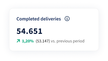 What it shows:This KPI tracks the number of parcels that have their label creation date within the selected date range, and had a first delivery attempt at any point in time.
A green upward trend indicates an increase in completed deliveries compared to the previous period, while a red downward trend signals a decrease.
Utility: This KPI is crucial for monitoring overall delivery performance and ensuring customer satisfaction by tracking the timeliness of parcels.
It also provides valuable insights into carrier performance, allowing you to:
- Compare carriers based on delivery success rates.
- Support carrier negotiations by using performance data as evidence.
- Proactively inform customers if deliveries in certain lanes are consistently delayed.
- Adjust customer expectations by identifying lanes where delivery performance deviates from the norm.
Late
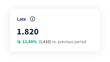 What it shows: This KPI counts parcels that have their label creation date within the selected date range and a first delivery attempt that exceeds Sendcloud’s expected lead time for the selected shipping method.
The accuracy of this KPI is based on Sendcloud’s internally calculated lead times, which reflect historical shipping performance rather than carrier-defined standards.
Consequently, there may be cases where:
- Parcels are missed as delayed.
- Parcels are marked as late even if they fall within the carrier’s acceptable transit times.
Undelivered
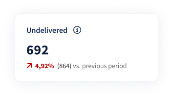 What it shows: The Undelivered KPI displays parcels that have their label creation date within the selected date range, and have been shipped, but no first delivery attempt, indicating they are still in transit.
A green downward trend signifies a decrease in parcels in transit compared to the previous period, while a red upward trend indicates an increase.
Utility: This helps monitor delivery progress and identify potential delays. It can also be used to spot an increase in undelivered parcels.
Delivered on time
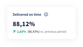
What it shows: This KPI counts parcels whose label was created within the selected date range and that were successfully delivered at the first attempt within Sendcloud’s expected lead time for the shipping method.
These lead times are based on historical performance data and are not necessarily the same as the carrier’s official transit times.
Utility: This metric allows you to monitor carrier performance by assessing whether parcels are delivered within the expected timeframe.
Parcels and on-time deliveries
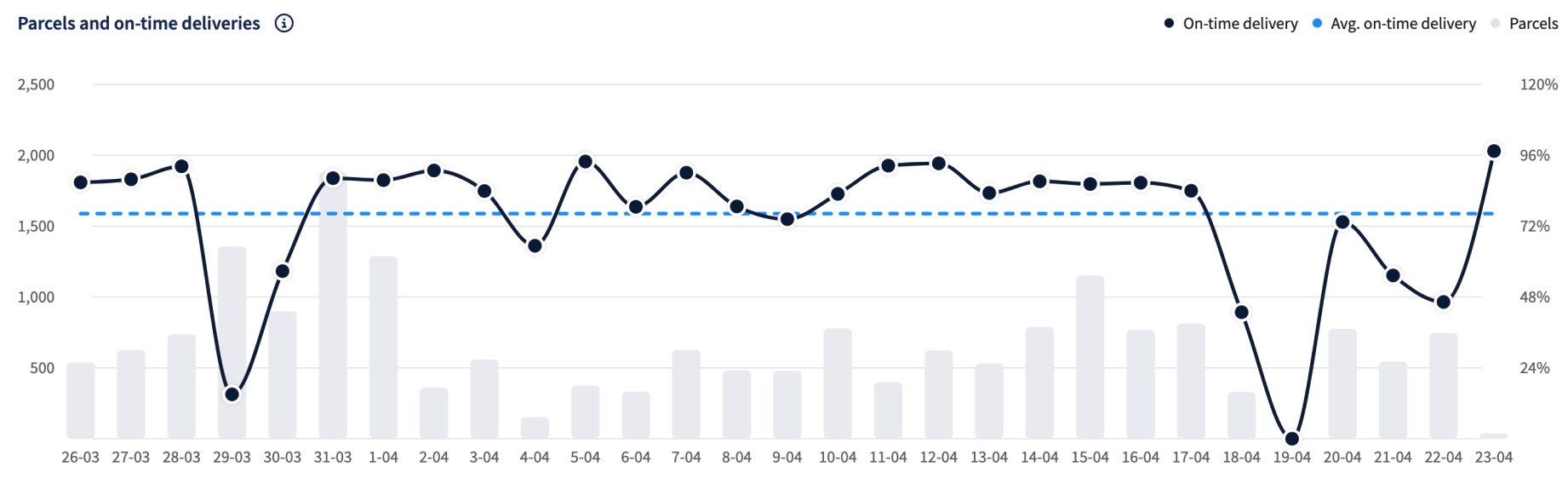
How is "on time" delivery calculated?
Parcel Delivery Timing Calculations For KPIs related to delivery timing, the 'on time' or 'late' classification is based on lead times calculated by Sendcloud. These lead times are internal indicators derived from historical delivery data, considering the shipping method and lane, and are not defined by the carrier. A parcel is considered 'delivered on time' if it is successfully delivered within the calculated lead time at the first delivery attempt.
| KPI | Description |
| ⚫️ On-time delivery | This line shows parcels whose label was created within the selected date range and that had a first delivery attempt made within Sendcloud’s expected lead time. Note: "Delivered" here refers to the first delivery attempt, not the final delivery confirmation. |
| 🔵 Avg. on-time delivery | This line shows the benchmark of parcels that had their label created within the selected date range and a first delivery attempt within Sendcloud’s expected lead time. It represents the average on-time delivery rate for the selected filter period. |
| ⚪️ Parcels | This bar chart shows the number of parcels sent in a specific date range. |
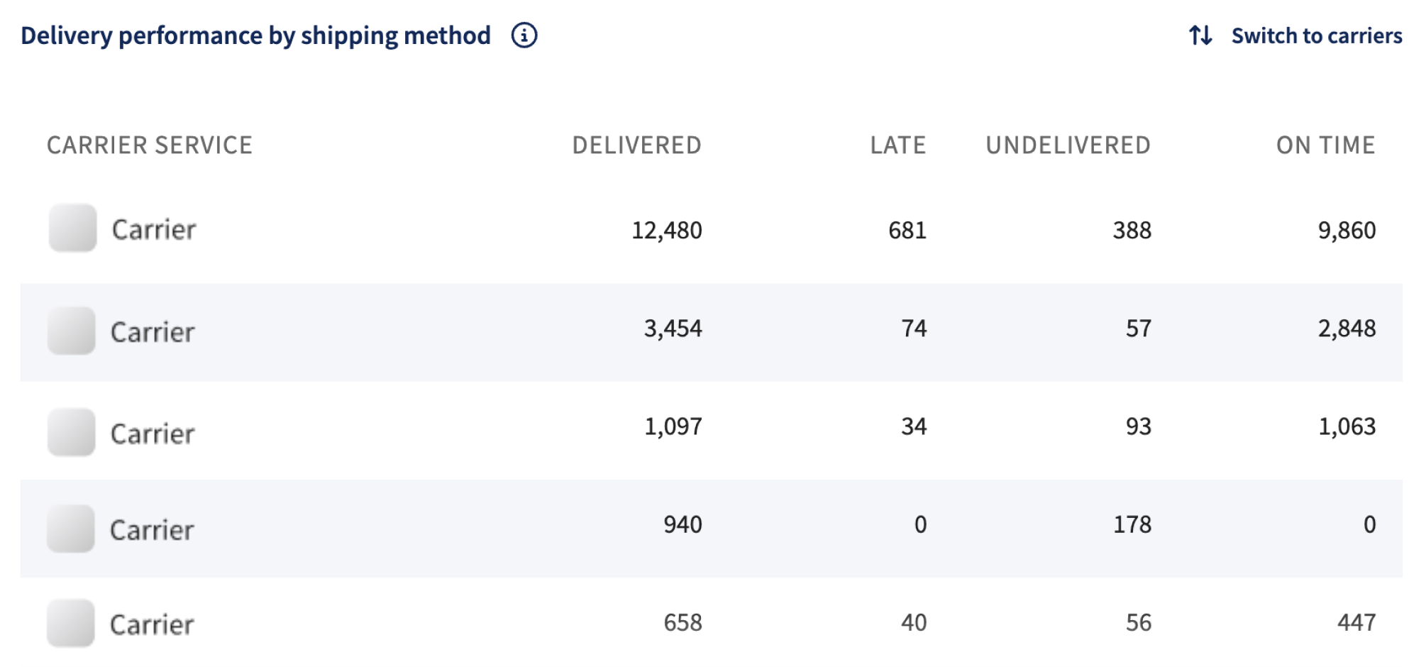
Delivery performance by shipping method
This table presents delivery performance by shipping method or carrier, including delivered parcels, late deliveries, undelivered parcels, and the on-time percentage.
The breakdown is based on Sendcloud’s expected lead times, not the carrier’s official transit standards.
Parcel counts are based on parcels that had their label creation date within the selected date range, and are categorized as follows:
- On-time: First delivery attempt made within Sendcloud’s expected lead time.
- Late: First delivery attempt made after Sendcloud’s expected lead time.
- Undelivered: Parcels without a recorded first delivery attempt.
The parcel counts for each shipping method or carrier follow the same KPI definitions as the KPIs at the top of the dashboard.
A vertical scroll is available to view additional rows as needed. For interaction, the Switch to Carriers/Shipping Methods option enables toggling between carriers and shipping methods.
Perfect order rate
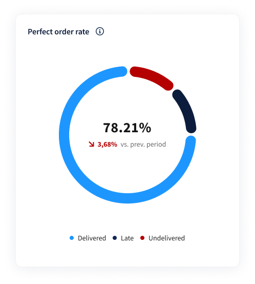
The Perfect Order KPI measures the ratio of successfully delivered parcels versus unsuccessfully delivered parcels, based on Sendcloud’s expected lead times.
It includes parcels whose label creation date falls within the selected date range.
Parcels are classified as:
Successful: First delivery attempt occurred within Sendcloud’s expected lead time.
Unsuccessful: Either no first delivery attempt has occurred yet (undelivered) or the first delivery attempt occurred after the expected lead time (late).
Important: An undelivered parcel does not necessarily mean there is a defect or exception; it may still be in transit.
Performance trends:
A high Perfect Order rate indicates strong delivery performance.
- A green upward trend reflects an improvement compared to the previous period.
- A red downward trend signals a decline in delivery performance.