Purpose: This article provides a clear and detailed breakdown of shipping surcharges, helping you understand where additional costs come from and how they impact your overall shipping spend.
Surcharge Breakdown Explained
This article explains how to use the Surcharge Breakdown dashboard to analyze the types, frequency, and cost impact of surcharges applied to your shipments. You'll learn how to identify top surcharge drivers, compare costs by destination or shipping lane, and assess the average surcharge per parcel.
Use this dashboard to gain transparency on extra shipping fees and uncover opportunities to optimize costs, adjust shipping strategies, or avoid common surcharge triggers.
Filters
The analytics feature includes multiple filter options, allowing you to refine data and analyze specific aspects of your shipping activities. Using filters effectively helps in identifying trends, assessing performance, and making data-driven decisions. For the Shipping Costs dashboard, we have the following filters available.
Check here the available filters:
You can customize the dashboard view using the following filters:
- Date Range – Select a specific time period to analyze shipping trends over days, weeks, or months.
- Brand – Filter parcels by a specific brand if multiple brands are managed under one account.
- Carrier – View parcels handled by a particular carrier to assess the shipping costs of a specific carrier.
- Destination Country – Focus on parcels delivered to a specific country to evaluate regional shipping efficiency.
- Integration – Narrow down parcels by sales channels, such as specific e-commerce platforms or order management systems.
- Origin Country – Analyze parcels based on their country of origin to assess outbound shipping trends.
- Product Name – Filter data based on specific products to track their shipping performance and return rates.
- Product SKU – Use SKU-based filtering to monitor the parcels trends of individual product variants.
KPIs and their description
Parcels in view
 What it shows:
This KPI represents the total number of parcels within the selected date
range.
What it shows:
This KPI represents the total number of parcels within the selected date
range.
It helps assess the reliability of the other data presented in the overview.
A higher number of included parcels generally indicates that the insights
derived from the data are more meaningful.
Total surcharges
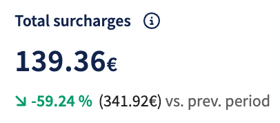 What it shows:
This KPI shows the combined value of all surcharges within the selected date
range, added to shipments, such as fuel, remote area, or additional service
fees. It provides insight into how much of your total shipping cost is driven
by these extra charges.
What it shows:
This KPI shows the combined value of all surcharges within the selected date
range, added to shipments, such as fuel, remote area, or additional service
fees. It provides insight into how much of your total shipping cost is driven
by these extra charges.
Avg. surcharge per parcel
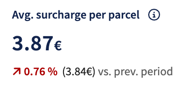 What it shows:
This KPI reflects the average total surcharge applied per parcel over the
selected date range. It gives you insight into how significantly surcharges
are contributing to the cost per parcel, helping evaluate cost efficiency
and spot potential savings.
What it shows:
This KPI reflects the average total surcharge applied per parcel over the
selected date range. It gives you insight into how significantly surcharges
are contributing to the cost per parcel, helping evaluate cost efficiency
and spot potential savings.
Surcharge per parcel
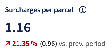 What it shows:
This KPI indicates the average number of different surcharge types applied
per parcel within the selected date range. It helps you understand how complex
your shipments are regarding added fees, revealing whether multiple surcharge
categories (like fuel, dimensional, or residential) are commonly combined
per parcel.
What it shows:
This KPI indicates the average number of different surcharge types applied
per parcel within the selected date range. It helps you understand how complex
your shipments are regarding added fees, revealing whether multiple surcharge
categories (like fuel, dimensional, or residential) are commonly combined
per parcel.
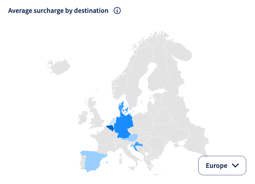
Average surcharge by destination
What it shows: This geo map displays the average surcharge amount, within the selected date range, by destination country. Darker shades indicate destinations with higher average surcharge values. Use this map to spot geographic patterns and determine where surcharges might be driving up delivery costs.
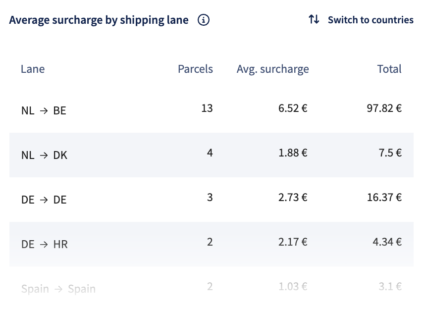
Average surcharge by shipping lane
What it shows: This table provides a breakdown of surcharge amounts across different shipping lanes within the selected date range. It includes:
- Shipping lane: Route based on origin and destination countries.
- Shipments: The number of parcels shipped on each lane.
- Average surcharge: The average surcharge applied per parcel.
- Total: The cumulative surcharge cost for each lane.
You can switch to country view to get a destination-level overview instead of lane-specific data.
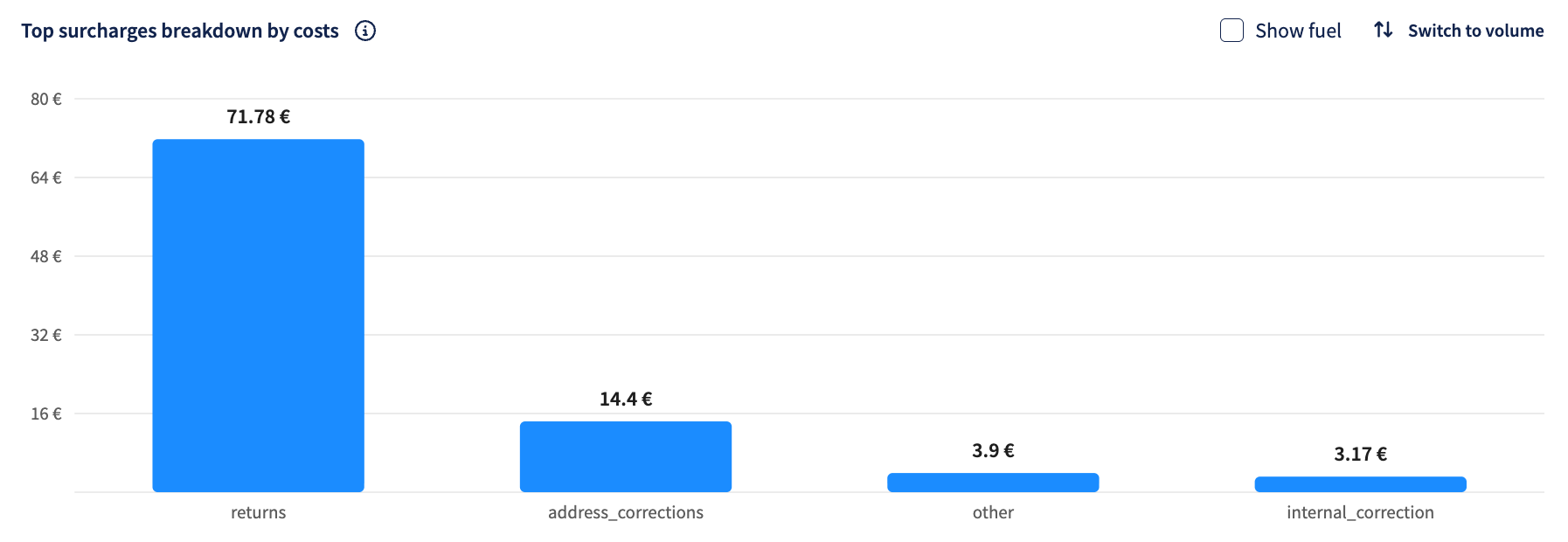
Top surcharges breakdown by costs
What it shows: This bar chart highlights the top surcharge types, within the selected date range, ranked by costs. Use the toggle to switch between views and uncover which surcharges contribute most to your overall spend or occur most frequently.
You can also check the Show fuel box if you want the fuel surcharge costs to be included.
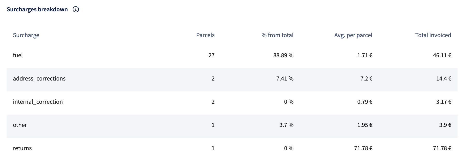
Surcharges breakdown
What it shows: This detailed table lists all surcharges applied within the selected date range, including shipment volume, share of total surcharges, average cost per parcel, and total invoiced amount. Use the available filters to analyze by carrier, surcharge type, or other variables for a deeper dive.