
Purpose: This article will provide a clear and actionable overview of your shipping activities, enabling effective management and optimization of your logistics processes.
The Shipping Overview Dashboard allows you to analyse data starting from January 1st, 2024. Any comparisons or trend analyses will use this date as the earliest available reference point. Data from before this date is not accessible through the dashboard.
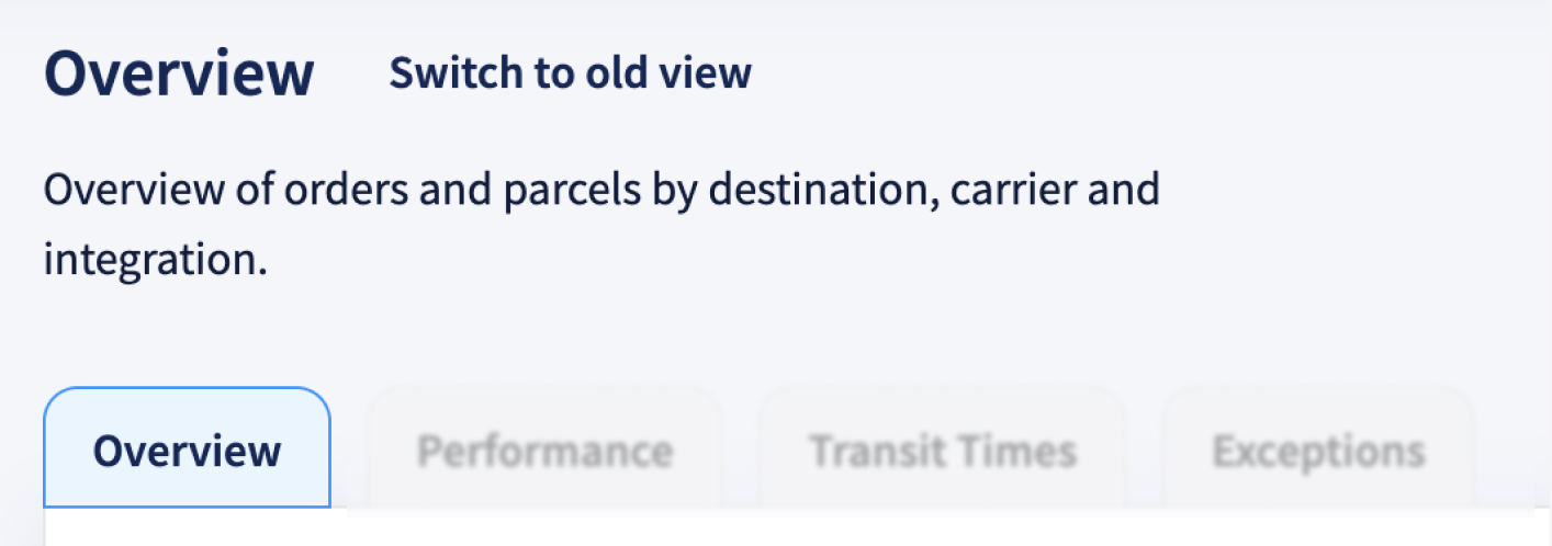
Shipping Overview Explained
The Shipping Overview dashboard gives you a high-level view of your outbound shipping activity. It helps you track key metrics like incoming orders, created labels, shipped parcels, return rates, and parcel distribution across countries, carriers, and sales channels.
You can use filters to explore trends over time and across specific segments like carrier, destination, brand, or integration. This dashboard is ideal for identifying patterns, spotting irregularities, and gaining quick insights into your overall shipping volume and flow.
Trends
| Arrows | ↗ Indicates an increasing trend compared to the previous period*. This may represent a positive or negative change depending on the KPI. | ↙ Indicates a decreasing trend compared to the previous period*. Like the upward arrow, whether this is positive or negative depends on the specific KPI. |
| Colors |
● Represents an improvement in the metric. This does not necessarily mean an increase; in some cases, a decrease is desirable. For example, a lower return rate indicates fewer shipping issues and improved customer satisfaction. |
● Represents a decline in performance. However, an increase may also be negative, such as a rise in returns or parcels delays, which could signal operational inefficiencies. |
*What does "previous period" mean?
By default, the previous period refers to the timeframe immediately before the currently selected date range. It follows the same length as the selected period.
- If you choose a single month, the previous period is the month before (e.g., February 2025 → January 2025).
- If you select a range of months, the previous period will be the same length of time directly before that range (e.g., October–December, → July–September).
If you use the comparison filter, the trend metrics will be based on the custom timeframe you select, not the default "previous period." This means trends will reflect your chosen comparison range, rather than the automatically calculated period before your selected date range.
Filters
The analytics feature includes multiple filter options, allowing you to refine data and analyze specific aspects of your shipping activities. Using filters effectively helps in identifying trends, assessing performance, and making data-driven decisions.
Check here the available filters and their applications
You can customize the dashboard view using the following filters:
- Add Date Range (Shipping Overview only) – Use this filter to compare your selected timeframe against a second, custom date range. Applying this filter updates all graphs and trend metrics to reflect the comparison, enabling deeper analysis between two distinct periods.
- Brand – Filter parcels by a specific brand if multiple brands are managed under one account.
- Carrier – View parcels handled by a particular carrier to assess performance and reliability.
- Destination Country – Focus on parcels delivered to a specific country to evaluate regional shipping efficiency.
- Integration – Narrow down parcels by sales channels, such as specific e-commerce platforms or order management systems.
- Origin Country – Analyze parcels based on their country of origin to assess outbound shipping trends.
- Product Name – Filter data based on specific products to track their shipping performance and return rates.
- Product SKU – Use SKU-based filtering to monitor the parcels trends of individual product variants.